Ok here is the Before-Before (When it was Brett's Nursery)
*Cringe*

This takes huge guts to admit it was a total FAIL.
I was having a really hard time trying to decorate for a boy. (This was pre-Pinterest)

I was attempting the aqua and orange theme, but the aqua was too bright and
set the bad mood for the room. I never finished the room because I hated pretty much everything.
It's not even worth explaining... total.fail.

I made two of these mobiles, which I still think are awesome but they hit a sour note in that room.
Here is the Before after Mallie moved into the room.


iPhone pics
Just too many vibrant colors, made it tacky. Ugh Fail #2!!!
Now what you have been waiting for.... The pretty pictures!!
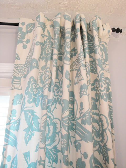
Mallie's Bedroom Reveal!
As you can see my photography skills improved as well. :0)
I am completely smitten with her room!
I will add her room to the Home Tour and list sources.
Hope you enjoyed.
~Melissa


What a beautiful little girl room. I adore all the little details :) You're so talented!
ReplyDeleteThank you Michaela!
Delete